Bazaarvoice Contextual Commerce™ for enterprise
Digital customer journeys as unique as your shoppers
Granify is now part of the Bazaarvoice platform
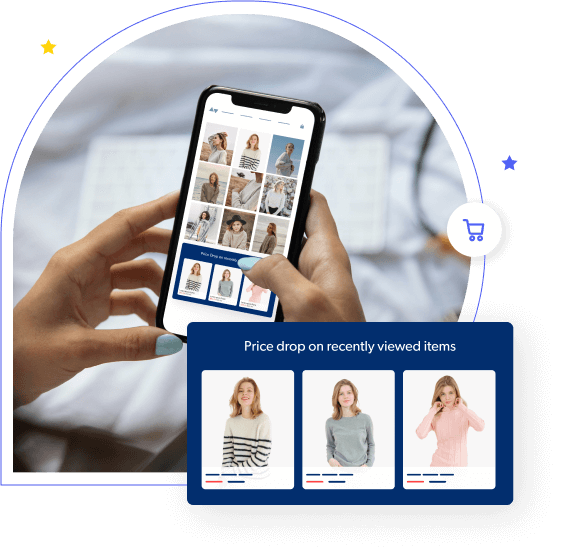
Deliver perfectly timed, intelligently tailored shopping experiences that delight shoppers, leverage social proof, and drive urgency, all while boosting incremental sales from your website traffic.
Trusted by the world’s largest retailers including:
The Bazaarvoice Contextual Commerce brain
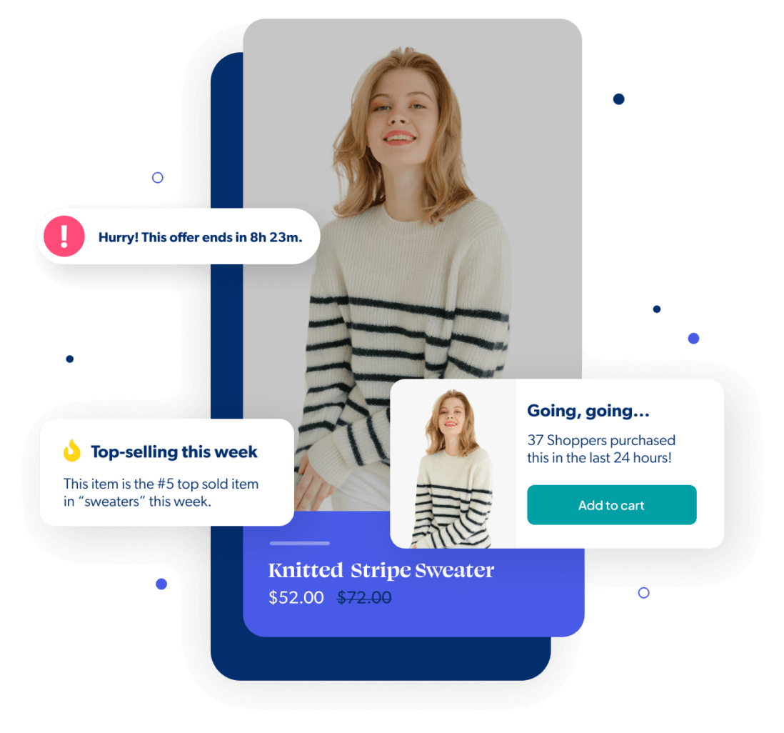
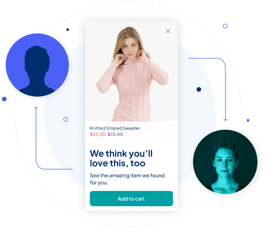
Our machine learning technology collects valuable insights into each shopper’s digital body language, compares it against accumulated data sets, and identifies ideal pathways to conversion. It determines when to show messages and equally important: when not to.
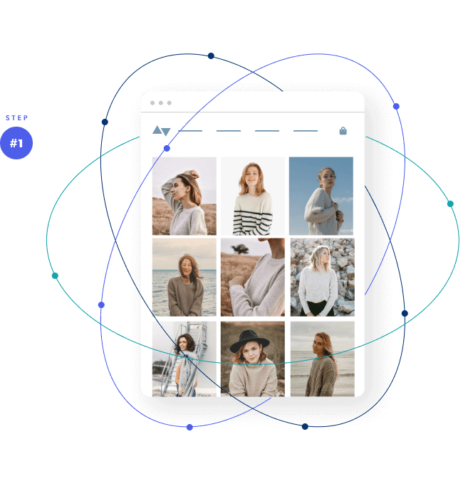
Insights are ingested & analyzed
Our machine learning technology collects valuable insights into each shopper’s digital body language, ingesting and analyzing hundreds of behavioral data points per second.
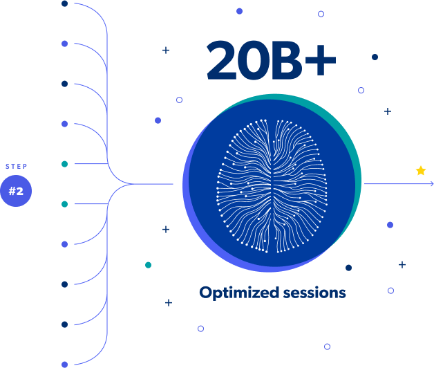
Pathways are identified
We then compare this stream of data to the 20 billion+ sessions already optimized to identify the optimal pathway to conversion for each unique shopper.
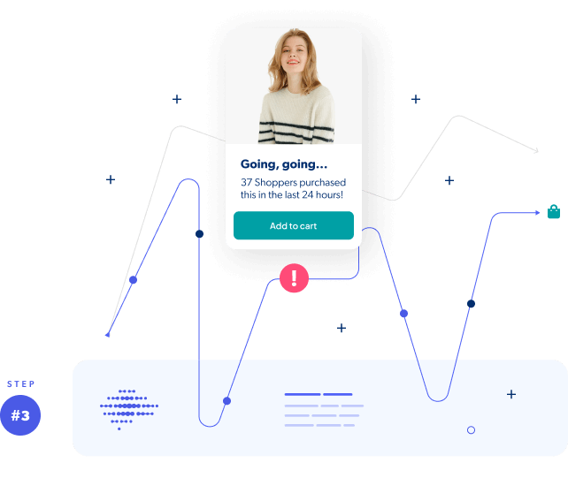
Messages are delivered at the perfect time
Finally, we step in (only when mathematically optimal) with highly targeted product spotlights and dynamic contextualization that’s proven to turn shoppers into paying customers.
ENHANCE EVERY MOMENT
Intelligent tech that drives incremental revenue
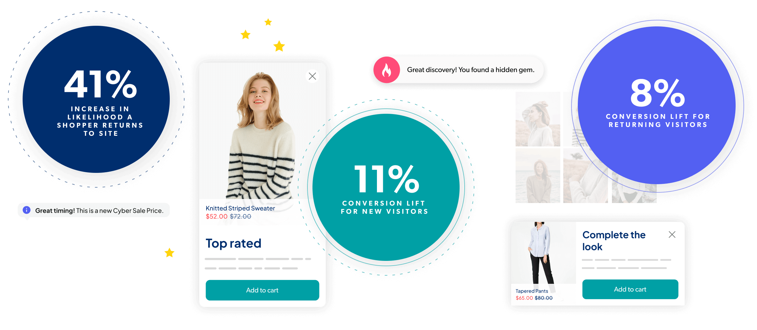
With advanced machine learning, you can deliver the highly relevant experiences today’s shoppers crave, at exactly the right moment. It’s tech that improves over time so you’ll see more revenue from it – true incremental revenue – above and beyond the results you’re already seeing today.
drive MORE REACH
Personalized experiences for both known and unknown shoppers
We use shoppers’ real-time behavioral data (not PII) to create dynamic, contextualized shopping experiences. This means you can use Contextual Commerce on its own or combine it with your other personalization offers and, either way, everyone who visits your website gets the best experience (whether new to the site or not).
A true partnership
We do all the heavy lifting
White-glove service means we’re bringing our chops to this partnership. You’ll get proactive strategic guidance from dedicated experts to drive the right outcomes, faster implementation, a program that works without requiring you to dedicate resources to it, and ongoing support that molds to your needs (not the other way around).
Only pay for proven impact
We start with a proof of value trial period so you can be confident of the incremental revenue we’ll generate and then we only charge for the incremental revenue you wouldn’t otherwise have without us. And, we make sure you always see results. It’s a no-risk, surefire path to revenue uplift.
Express your interest
Contextualization works best for companies with sufficient website traffic. If this sounds like you, check to see if Contextual Commerce is a good fit for your business situation and goals.
Learn more